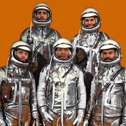
 Not as long ago as 40 years ago, but just a little over 10 years ago – The Chopping Block adopted the look of NASA
  for one of our online incarnations. More specific our adopted look embraced the era of Apollo in hopes that a little of that former astro-glory might rub off on our small New York graphic design studio which was at that time only about a year old. So we thought it appropriate on this 40th anniversary of the touchdown at Tranquility Base, that we revisit our own journey through cyberspace and our small tribute to the historic landmark that is Apollo.
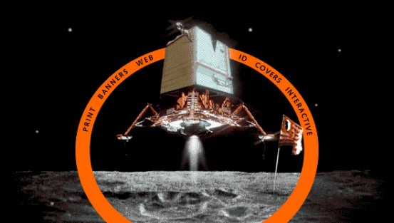
 If there is one thing we like to do at The Chopping Block, it is to take our logo and make it look like something else. In this case, we became quite possibly the first design company to ever merge the design of the Apollo Lunar Excursion Module with their own logo mark. Thusly, resulting in the world’s first merging of state-of-the-art of 196o’s technology with early web identity design.
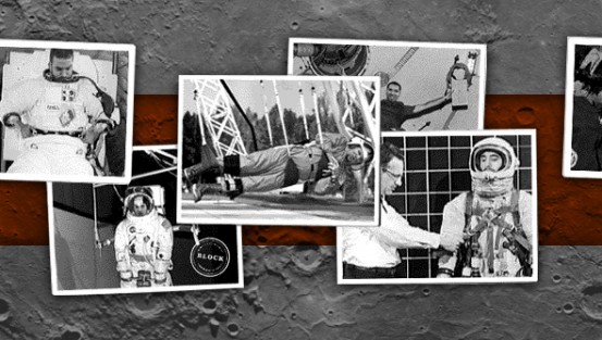
 And what fake space exploration site would be complete without fake astronaut training pix?
See the original site as it appeared in 1998 here. Also see our current site choppingblock.com for more recent projects.